

The best client growth visualization tools convert raw client data into charts, dashboards, and trend lines that any stakeholder can read in seconds. Whether you are tracking monthly recurring revenue, retention rates, or campaign performance, the right platform removes the guesswork from client reporting and replaces it with clarity. The tools covered here range from spreadsheet-based options like Microsoft Excel to purpose-built platforms like ClickCoach, and each serves a distinct reporting need.
An effective client dashboard typically includes KPI summary cards, trend lines showing movement over time, channel breakdowns, and a narrative layer that explains what the numbers mean. Effective reporting stacks integrate four layers: data source, central repository, visualization, and a narrative layer that converts data into strategic decisions, cutting reporting time significantly. Without that narrative layer, even a beautifully designed dashboard leaves clients asking, “So what does this mean for us?”
- KPI summary cards surface the three to five metrics that matter most to the client’s business goals
- Trend lines show directional movement so clients can see progress, not just a snapshot
- Channel breakdowns attribute results to specific campaigns or sources
- Narrative commentary explains why numbers moved and what to do next
Pro Tip: Before building any dashboard, agree with your client on the top three KPIs tied directly to their revenue or growth goals. Every other metric is secondary, and keeping it that way prevents the “metric hoarding” trap that buries the story inside the data.
What types of data visualizations work best for client growth?
The chart type you choose shapes how quickly a client grasps a trend, and the wrong choice can obscure a win or hide a problem. Line charts are the workhorse of growth reporting: they show directional movement over time and make acceleration or deceleration immediately visible. Bar charts handle category comparisons well, such as revenue by channel or leads by campaign. Pie and donut charts work for composition, though they lose accuracy when you have more than five segments.

For deeper client analysis, cohort analysis groups clients by signup date or behavior to reveal retention patterns using three primary visualization types: Triangle Heatmaps, Retention Curves, and Layer Cake (stacked area) charts. A Triangle Heatmap, for example, lets you see at a glance which client cohorts are churning fastest and at what point in the relationship. These advanced formats belong in retention-focused reports, not in every monthly summary.
| Visualization Type | Primary Purpose | Best Use Case |
|---|---|---|
| Line chart | Show trends over time | Monthly revenue, user growth, session counts |
| Bar chart | Compare categories | Channel performance, campaign results |
| Pie / donut chart | Show composition | Traffic source split, budget allocation |
| Triangle Heatmap | Cohort retention | Client churn by signup month |
| Retention Curve | Retention rate over time | Long-term client relationship health |
| Layer Cake (stacked area) | Cohort contribution over time | Revenue by client cohort |
Combining chart types within a single report creates a fuller picture. A line chart showing total revenue growth paired with a Layer Cake chart breaking that growth by client cohort tells a richer story than either visual alone. The key is pairing visuals intentionally, not stacking them for volume. Cognitive overload sets in fast when a dashboard presents too many chart types at once, so keep the combination purposeful and limited.
Best practices and common pitfalls in client reporting
The five principles that separate effective client dashboards from cluttered ones are Clarity, Context, Color, Consistency, and Chart Selection. Clarity means every visual answers one specific question. Context means the number is always shown against a benchmark, target, or prior period. Color, Consistency, and Chart Selection round out the framework, and each one is easy to get wrong.
Limit color to status indicators: red for below target, amber for at risk, green for on track. Decorative color palettes look polished but train clients to ignore the color coding, which defeats the purpose. Restrict each dashboard tab to six visualizations maximum. Beyond six, clients stop reading and start skimming, which means they miss the insights you worked hardest to surface.
Pro Tip: Use descriptive chart titles that state the finding, not just the metric name. “Organic traffic up 23% month over month” tells the client something. “Organic Traffic” tells them nothing. The title should answer the question before they even look at the chart.
The inverted pyramid layout places three to five critical KPIs at the top as large summary cards, trend data in the middle, and granular detail at the bottom. This structure lets a client assess performance within five seconds without scrolling. Most reporting mistakes happen at the top of that pyramid: too many metrics, too small, and no clear signal about what is good or bad.
- Avoid “metric hoarding”: displaying every available data point dilutes the metrics that actually matter
- Never use 3D charts: they distort proportions and slow comprehension
- Skip decorative icons and gradients that add visual noise without adding meaning
- Always show a comparison period so clients can judge whether a number is good or bad
Which tools are best for visualizing client growth data?
The six tools most widely used by US marketing and business professionals each occupy a different position on the spectrum from general-purpose to purpose-built for client reporting.
Microsoft Excel
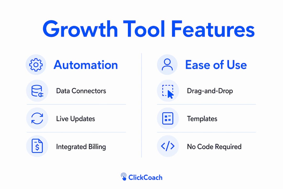
Excel remains the most accessible entry point for growth analytics. Its pivot tables, conditional formatting, and chart library cover most standard reporting needs without any additional software cost for teams already in the Microsoft 365 ecosystem. The limitation is manual effort: every data refresh requires human intervention unless you build Power Query connections, and even then, the workflow is fragile at scale. Excel works well for analysts who need full control over calculations and formatting, but it does not scale gracefully beyond a handful of clients.

Power BI
Power BI connects directly to hundreds of data sources, from SQL databases to Google Analytics 4, and refreshes dashboards automatically on a schedule. Its DAX formula language gives analysts precise control over calculated metrics, and its sharing features let you publish live dashboards to client portals. The learning curve is real: building a production-ready Power BI report requires comfort with data modeling concepts that go beyond standard spreadsheet skills. For teams managing large client portfolios with complex data infrastructure, Power BI is one of the most capable options available.
Tableau
Tableau’s drag-and-drop interface makes it faster to build sophisticated visualizations than most alternatives, and its community of published workbooks means you can often find a starting template for common client growth scenarios. The platform excels at exploratory analysis, where you need to slice data quickly to find the story before you build the final report. Pricing runs higher than most tools in this category, which makes it a better fit for agencies with established client bases than for solo practitioners or small teams.
Google Charts
Google Charts is a free JavaScript library that embeds interactive charts directly into web pages and Google Sites. It requires developer involvement to implement, which limits its audience to teams with technical resources. The payoff is full customization and zero licensing cost. For agencies that build custom client portals, Google Charts provides the visualization layer without adding a software subscription.
Infogram
Infogram targets marketing teams that need publication-ready visuals without a developer. Its template library covers infographics, reports, and interactive charts, and the output is designed to look polished in client presentations. Integration with live data sources is more limited than Power BI or Tableau, so Infogram works best for periodic reports rather than real-time dashboards.
ClickCoach
ClickCoach is built specifically for coaches who need to track client progress, session history, and growth metrics in one place. Rather than assembling a reporting stack from separate tools, ClickCoach unifies session management, billing, homework assignments, and client progress tracking under a single login. Its AI assists in drafting homework and monitoring client progress over time, which reduces the manual work of building individual client summaries. For coaches managing multiple clients, the platform’s branded client portals give each client a clear view of their own progress without requiring the coach to export and format data manually.
| Tool | Ease of use | Growth visualization features | Automation and integration | Pricing model | Best for |
|---|---|---|---|---|---|
| Microsoft Excel | High (familiar) | Charts, pivot tables, conditional formatting | Manual or Power Query | Included in Microsoft 365 | Small teams, analysts |
| Power BI | Moderate | Rich dashboards, DAX metrics, live data | Strong: 100+ connectors | Free tier; Pro plan paid | Mid to large agencies |
| Tableau | Moderate | Advanced drag-and-drop, exploratory analysis | Strong: broad connector library | Subscription, higher cost | Data-heavy agencies |
| Google Charts | Low (requires dev) | Interactive web charts, fully customizable | Custom via API | Free | Technical teams, custom portals |
| Infogram | High | Infographics, presentation charts, templates | Limited live data | Free tier; paid plans | Marketing teams, presentations |
| ClickCoach | High | Progress tracking, session history, growth dashboards | Built-in: session, billing, homework | Subscription | Coaches, client-facing practices |
How do you choose the right client growth visualization tool?
Start by auditing your current data infrastructure before evaluating any tool. If your client data lives in disconnected spreadsheets, the most sophisticated visualization platform will still produce unreliable outputs. Clean, centralized data is the prerequisite, not the afterthought.
From there, work through these evaluation criteria in order:
- Integration capabilities: does the tool connect natively to your existing data sources, such as your CRM, ad platforms, or billing system?
- Client volume and complexity: a solo practitioner with five clients has different needs than an agency managing fifty accounts with multi-channel data
- White-label options: if clients will see the dashboard directly, does the tool support your branding?
- Automation: can the tool refresh data and distribute reports without manual steps each cycle?
- AI-powered narrative: does the platform generate written summaries or flag anomalies automatically, or does that work fall entirely on you?
- Role-based access: can you control what each client or team member sees within the same platform?
Pro Tip: Tying your KPIs directly to business outcomes like revenue or lifetime value prevents the reporting conversation from drifting into metric debates. When a client can see that their retention rate connects directly to projected revenue, the discussion shifts from “what does this number mean” to “what do we do next.”
One common selection mistake is choosing a tool based on its feature list rather than your clients’ actual data literacy. A platform with fifty chart types is only useful if your clients can read and act on those charts. Match the tool’s complexity to the sophistication of your client base, and build in room to grow as both sides develop more reporting fluency.
What does the research say about effective growth visualization?
The most consistent finding across visualization research is that cognitive load is the primary enemy of client comprehension. A dashboard that requires mental effort to decode is a dashboard that clients stop reading. The design decisions that reduce cognitive load are specific and repeatable.
Organizing metrics into tiers focused on business outcomes, campaign diagnostics, and operational details prevents information overload and keeps the client’s attention on what drives decisions. The top tier belongs to revenue-linked KPIs. Everything else is support material. Agencies that apply this tiering structure report fewer client questions during review calls, because the dashboard answers the most important questions before the meeting starts.
| Cohort visualization type | What it shows | Primary benefit |
|---|---|---|
| Triangle Heatmap | Retention rate by cohort and time period | Identifies which client groups churn fastest |
| Retention Curve | Percentage of cohort retained over time | Benchmarks long-term relationship health |
| Layer Cake chart | Revenue or activity contribution by cohort | Shows which cohorts drive the most growth |
Research-backed principles for agency professionals:
- The inverted pyramid layout enables performance assessment within five seconds, reducing the need for verbal explanation during client calls
- Six visualizations per screen is the upper limit before comprehension drops; fewer is usually better
- Descriptive chart titles that state findings directly reduce client questions and speed up review meetings
- Human narrative commentary in reports justifies service value in ways that automated data aggregation cannot replicate
- Linking KPIs to revenue or lifetime value is the single most effective way to prevent wasted analytic effort
The integrated reporting stack, with its four layers of data source, repository, visualization, and narrative, is the architecture that makes all of these principles work together. Skipping the narrative layer is the most common mistake agencies make, and it is also the layer that most directly affects client satisfaction and retention.
Detailed comparison of top tools: pros, cons, pricing, and target users
Microsoft Excel
Pros: universally familiar, no additional licensing cost for Microsoft 365 subscribers, full formula control. Cons: manual data refresh, limited collaboration features, does not scale beyond small client sets without significant engineering. Best for analysts who need calculation flexibility and already work inside the Microsoft ecosystem.
Power BI
Pros: strong automation, broad connector library, live dashboards shareable via web link. Cons: DAX learning curve, requires data modeling knowledge, can become complex to maintain at scale. Pricing includes a free desktop version; the Pro plan, required for sharing and collaboration, carries a monthly per-user fee. Best for mid-size to large agencies with dedicated analysts.
Tableau
Pros: fast exploratory analysis, large template community, polished output. Cons: highest price point in this group, steeper learning curve than most alternatives, licensing cost can be difficult to justify for smaller practices. Best for data-heavy agencies where visualization quality directly affects client retention.
Google Charts
Pros: free, fully customizable, embeds in any web property. Cons: requires JavaScript development skills, no built-in data connectors, no hosted dashboard environment. Best for technical teams building custom client portals where licensing cost is a constraint.
Infogram
Pros: fast to use, strong template library, presentation-ready output. Cons: limited live data integration, not designed for real-time dashboards, free tier has export restrictions. Best for marketing teams producing periodic reports and client presentations rather than live monitoring.
ClickCoach
Pros: purpose-built for client-facing coaching practices, unified platform covering sessions, billing, progress, and homework, AI-assisted client summaries, branded portals. Cons: designed specifically for coaching contexts rather than general marketing analytics. Best for coaches and practitioners who need a single system to manage the full client relationship and demonstrate measurable progress over time.
How do these tools connect to your existing data sources?
Integration capability is often the deciding factor when choosing between tools that otherwise look similar on paper.
Power BI connects natively to over 100 data sources, including Salesforce, Google Analytics 4, HubSpot, SQL Server, and Excel files. Its scheduled refresh feature means dashboards update automatically without manual exports. Tableau offers a comparable connector library and adds live query options for databases, so the dashboard always reflects current data rather than a snapshot from the last refresh.
Google Charts requires custom API work to pull data from external sources, which means integration depth depends entirely on your development resources. Infogram supports connections to Google Sheets and a limited set of live data sources, which covers basic use cases but falls short for agencies managing complex multi-channel data.
Microsoft Excel integrates with external sources through Power Query, which can connect to APIs, databases, and cloud services. The setup requires technical knowledge, and the connections can break when source schemas change. For teams already invested in the Microsoft ecosystem, this is often the most practical path to automated data refresh without adopting a new platform.
ClickCoach handles integration differently. Rather than connecting to external marketing data sources, it centralizes the data that coaching practices generate internally: session notes, homework completion, billing records, and progress milestones. For coaches, this internal data is the growth story. Connecting client success metrics to a single platform removes the need to reconcile data from multiple apps at the end of each reporting cycle.
How do you customize visualizations for different clients and contexts?
Not every client reads a dashboard the same way, and the format that works for a data-literate marketing director will confuse a founder who checks in once a month. Customization is not about aesthetics. It is about matching the visual complexity to the reader’s familiarity with data.
For executive-level clients, strip the dashboard down to the top three KPIs, a single trend line, and one sentence of narrative per metric. These clients want to know if the number is up or down and what you are doing about it. For operational clients who review data weekly, a second tier of campaign diagnostics and channel breakdowns gives them the detail they need without cluttering the executive view.
Presentation context matters as much as client type. A live screen share during a video call calls for large text, high contrast, and no more than two visuals per slide. A PDF report sent asynchronously can carry more detail because the client controls the pace. An embedded portal that clients access on their own schedule needs clear navigation and self-explanatory chart titles, because you will not be there to explain anything.
Consistent formatting across reporting periods builds client familiarity faster than any design choice. When the layout, color scheme, and metric positions stay the same month after month, clients spend less time orienting themselves and more time engaging with the actual findings. Tying your KPI reporting structure to concrete business outcomes, like revenue impact or retention improvement, gives clients a reason to care about the numbers rather than just acknowledge them.
ClickCoach gives coaches one place to track client growth
Most coaches piece together their client reporting from notes, spreadsheets, and email threads. The result is a fragmented picture that takes time to assemble and rarely tells a coherent story. ClickCoach solves that by putting session management, billing, homework assignments, and client progress tracking under one login, so the full client relationship lives in one organized system.
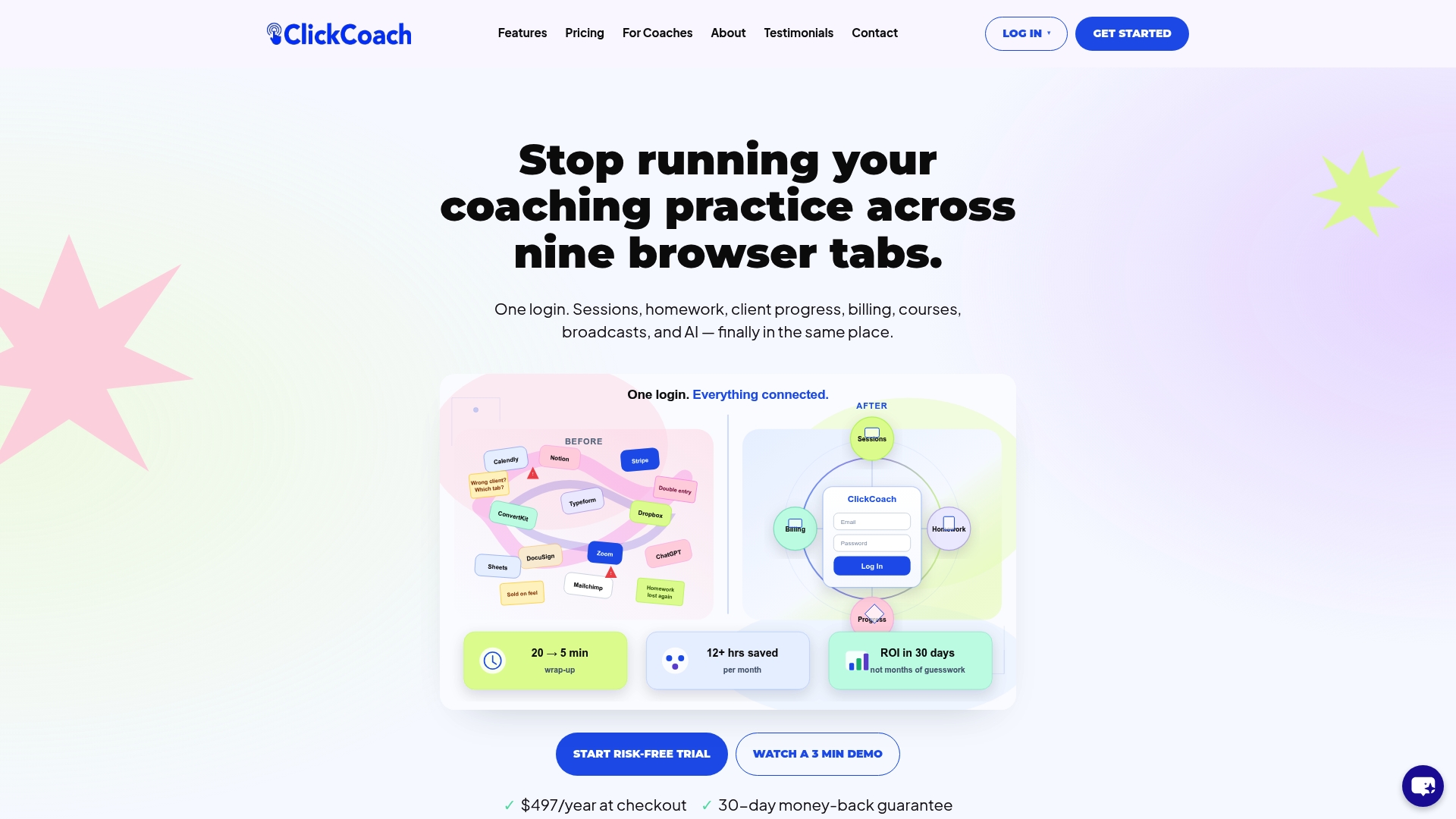
The platform’s AI assists in drafting homework and monitoring progress between sessions, which means coaches spend less time on administrative work and more time on the conversations that actually move clients forward. Branded client portals give each client a clear view of their own progress, which improves engagement and follow-through between meetings. Coaches using ClickCoach report saving up to 20 minutes per session by eliminating the back-and-forth of managing multiple tools.
Key benefits for coaches and their clients:
- Unified client records: goals, session history, homework, and progress in one place
- AI-assisted summaries: draft homework and progress notes without starting from scratch
- Branded portals: clients see their own progress in a professional, personalized environment
- Consistent process: a repeatable workflow that scales as your practice grows
- Time savings: up to 20 minutes saved per session by removing administrative drag
Ready to see how it works for your practice? Start with ClickCoach and give your clients the clear, consistent progress tracking they deserve.
Key Takeaways
The most effective client growth visualization tools combine clean data infrastructure, purposeful chart selection, and a human narrative layer that connects numbers to business outcomes.
| Point | Details |
|---|---|
| Prioritize KPIs over volume | Limit dashboards to three to five outcome-linked KPIs at the top; relegate supporting metrics to lower tiers. |
| Apply the visualization limit per screen | Cap each dashboard screen at six visualizations to maintain comprehension and reduce cognitive load. |
| Use descriptive chart titles | Titles that state findings directly, such as “Organic traffic up 23%,” reduce client questions and speed up reviews. |
| Match tool complexity to client needs | Choose visualization tools based on your clients’ data literacy and your team’s technical capacity, not feature count. |
| ClickCoach for coaching practices | ClickCoach unifies session management, progress tracking, and AI-assisted reporting in one platform, helping to save time on administrative tasks during sessions. |